Today, we are going to learn how we can change chart type dynamically depending on the selected value in the report parameter in SSRS (SQL Server Reporting Services) report. Report parameter has few predefined chart type as values in the report, and depending on the selected value in the parameter, chart renders in the report.
We know that there is no any inbuilt way which can be used to change the chart type at run time in SSRS and to achieve this we need to forge a couple of things. In this post we will discuss a method which can be used to achieve this. For demo, I am using AdventureWorks2014 database in this tutorial. I have attached the zipped project file which can be downloaded from here or from the link provided at the bottom end of this post.
Let’s create a dummy project in SSDT to demonstrate how we can change chart type dynamically in SSRS. Follow below steps:
- Open SQL Server Data Tools (SSDT).
- Go to File -> New -> Project.
- New project dialog box appears, choose Business Intelligence -> Reporting Services -> Report Server Project.
- Create a new shared data source. A connection to the AdventureWorks2014 database hosted on my local machine is created in the attached sample project. If you want to add this data source specific to a single report only, add data source in the report instead of adding it to the shared data source.
- Add a new report in the project. To add a new report:
- right click on the “Reports” folder in the solution explorer,
- hover mouse pointer to “Add” and select “New Item” from the sub menu. Optionally we can use “Ctrl + Shift + A” keys combinations.
- From “Add New Item” dialog box, choose “Report” and name it accordingly. In our sample project we named it to “DynamicChartDemo.rdl“. Click on “Add” button to add the report in the project.
- Add a link to the created shared data source in the report as a data source. To add,
- go to “Report Data” pane and right click on “Data Sources” folder,
- click on “Add Data Source“,
- Select “Use shared data source reference,
- from below drop down select the created shared data source,
- put a name for this data source connection,
- click on “Ok” button.
- Add a new data set in the report. To add,
- go to “Report Data” pane and right click on “Datasets” folder,
- choose “Add Dataset” from the menu,
- put some meaningful name,
- choose “Use a dataset embedded in my report” option,
- from data source drop down which becomes active now, choose the data source name added in this report,
- in query type, choose “Text” radio button option and use below query in the query box. (We are using inline sql query for demo purpose only. Inline sql queries are open for sql injections and must be avoided. Prefer to use stored procedures which are safe and also get benefit of plan reuseability which improves query performance.)
SELECT
DATEPART(MM, SOH.OrderDate) AS SalesMonthToSort,
DATENAME(MM, SOH.OrderDate) AS SalesMonth,
DATEPART(YEAR, SOH.OrderDate) AS SalesYear,
FLOOR(SUM(SOD.LineTotal)) AS TotalSale
FROM Sales.SalesOrderDetail SOD
INNER JOIN Sales.SalesOrderHeader SOH ON SOD.SalesOrderID = SOH.SalesOrderID
WHERE SOH.OrderDate BETWEEN '20130101' AND '20131231'
GROUP BY
DATEPART(MM, SOH.OrderDate),
DATENAME(MM, SOH.OrderDate),
DATEPART(YEAR, SOH.OrderDate)
ORDER BY SalesMonthToSort
- Click on “Ok”.
- Add a chart control in the report. To add,
- go to Toolbox -> Report Items -> double click on “Chart“.
- “Select Chart Type” dialog box appears, choose column chart and click on “Ok” button.
- Configure the data set for the chart. Right click on chart (in blank area), a context menu appears with “Chart Properties” option. In the dialog box, go to data set name drop down and select the created data set. Check the option “Add a page break after” to add a page break after the chart if you need to.
- Double click on the chart, a sub menu appears, in category groups click on + sign and select “SalesMonth“. Click on + sign in values and select “TotalSale“.

Configure category and value - Right click on the “SalesMonth” added in category groups and choose “Category Group Properties“. Click on sorting tab option in left pane and from sort by clause at right, remove “SalesMonth” column and add “SalesMonthToSort” column.

Change sort order for category - Set the height and width of the chart accordingly.
- Right click on axis title appeared on x-axis and choose “Horizontal Axis Properties“. In the “Horizontal Axis Properties” dialog box, set interval to 1 and leave interval type to auto.

Set interval and interval type - Copy the created chart and paste it. Position it on the report body and change the chart type to pie chart or you can add a new pie chart from tool box and configure the values accordingly. To change the chart type follow below steps:
- Right click on the blank space inside the chart to pop up the chart properties menu.
- Select “Change Chart Type” option listed at the top of the menu.
- Choose a new shape, for example; Pie in this demo, click on “ok” button.
- Again paste the copied chart and change the chart type to bar chart and position it accordingly. Optionally you can add a new bar chart from tool box and configure the values accordingly.
- Add a report parameter with three chart types as values; column, pie and bar. Steps are below:
- Go to report data pane.
- Right click on “Parameters“.
- Select “Add Parameter“.
- Put a proper name in the name box and the value which you want to display to the end user in prompt box (in our case, it is “Select Chart Type”).
- Change data type to integer.

Add report parameter - Go to Available values tab, choose specify values option and add “Column” as label with 1 as value, “Pie” as label with 2 as value and “Bar” as Label with 3 as value.

Specify values for chart type - Click on “Ok” button.
- Right click on the column chart to get the chart properties menu and select “Chart Properties” from the appeared menu. Go to visibility tab by choosing visibility on the left pane.
- In “When the report is initially run” option, click on “Show or hide based on an expression” radio button and use this expression. =IIF(Parameters!rptChartType.Value <> 1, True, False).
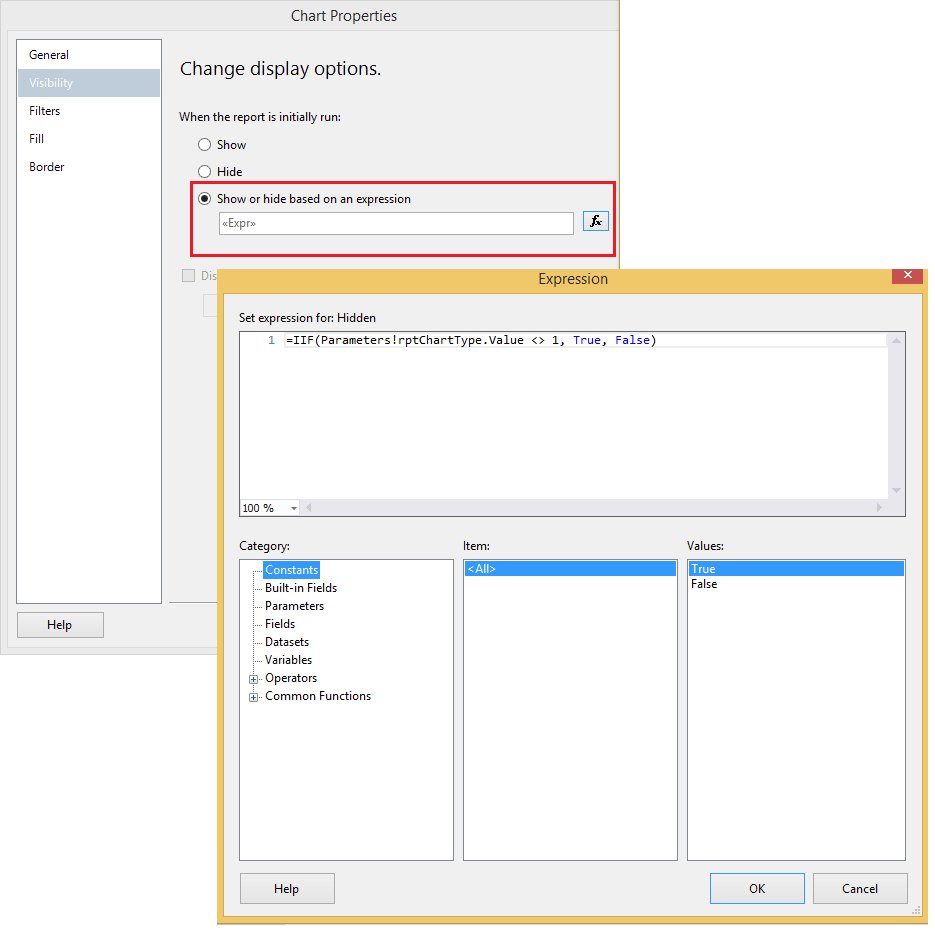
Add chart show hide expression - For Pie and Bar chart, repeat the step 17 and 18 and use these expressions =IIF(Parameters!rptChartType.Value <> 2, True, False) and =IIF(Parameters!rptChartType.Value <> 3, True, False) respectively.
- Run the report and select a value in chart type report parameter and click on view report button and see the different chart types depending on the selected values.
- Deploy the report wherever you want and have permission and check it in the browser.

Change chart type dynamically SSRS


Trick: Change chart type dynamically SSRS
As we know that SSRS does not provide any inbuilt method to change the chart type dynamically at run time. We create multiple charts in the report and add a chart type parameter, depending on the selected parameter value, we show and hide the created charts in the report. In this post, we have learnt how we can change the chart type dynamically in SSRS. I have attached the sample zipped project file created using Visual studio 2012 and AdventureWorks2014 database. To download the zipped project, click here.
Connect with us on social media to be updated:
Facebook || Google plus || Twitter
Thanks for the reading and please keep sharing and rating this post. Input your valuable feedback in the comment section of this post.
